 The fourth CZG horizontal design use (this time too) absolute position to place, under the title, two text sections in the header div and four ones (with the same height but diffent width) side by side under an inline menu and before the three other menu lists.
 The second photographic portfolio presented is the one by Meghan Petersen: a very long collection of pictures with equal height but different width placed -this time too- side by side in a nested table layout inserted in a (please don’t copy this) HTML frame.
The gallery is accompanied by another frame on the top that contains a fixed image with studio’s informations.
 The Jason Kottke’s Portfolio is an XHTML page that position its content side by side, at the same distance, using the foundamental (for the horizontal way , but not only) CSS float property.
This content is composed (except the last three text-only divs) by equally width & height boxes divided in a description part (a title plus three or less paragraphs) and a screenshot big as a half of the page.
 First Flash site here, Biok displays a static page with some sections (with a low quantity of text) scrolling inside.
Instead of lose the content of the previous page after a refresh (or better the change of the flash layer) the menu under the header allows so to navigate in a complete “overview†of what the site- in this case a consulting firm one- can offer.
 Like the two previous CSS design from CZG, the text colums that contains the demostrative sections are putted in the template with an absolute position. 1/2 difference: the distance of this colums from the top of page (few pixels for the even ones, about half of the page’s height for the odd). 2/2 difference is about the dimensions of the colums: previously there was an equal ‘limit’ of width, now the various column have different width to display, each one, a column’s height almost equal to the half of the page’s height.
 Unbury from the Web Archive limbo, the nDroid could be one of the first sites with horizontal layout ever appaired (the Archive shows 2000’s pages). The pixel-build fantasy of its creator illustrates a in a panoramic context – a very strange wide house – an harlequin mix of text and images that let ask ourself: “What is there on the right?â€.
 As we saw in the photographic example, an horizontal layout could be an original way to create a design portfolio. It’s the case of the guys of Sonido, who use an old nested table to place a very wide image where the transition from a section of a page to an other is very pleasant. The direct “jump†to these section is (this time, too) allowed by a menu with internal links. Except titles and the introduction, there is a so great quantity of text use expecially for links to agency’s projects: for this are necessary some (about four lines) boxes tall as much only 100px.
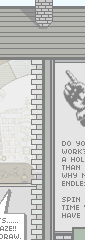
 The second (CSS, naturally) extract from the CZG. There aren’t so much layout differents from the previous: the sbs colums – that uses a CSS
 position:absolute property – this time are more thin and the last section is wider then the others to be tall as the others. A big image, tall as the page, is fixed at the left of the window and the menu is this time at the right of the last column.
 Eolo Perfido is a good example of how the horizontal layouting can help photography to show its best in the web world. Portfolio’s pages displays a series of equal height and equal width phographaps inserted side by side in table layout, and includes a simple menu on the left to switch over the other horizontal galleries. In the news page, instead, the images are smaller in size to let space to a little description below.
 The Dmitry Kirsanov Studio’s website – horizontal version born in 2002 – represents its contents with an old nested table layout divided horizontally in two parts: in the part below a title and image represent several projects, in the part above a small text completes the description. In some page, like “Our offer†these paragraphs are splitted in two or more colums. A fixed height but an unknow amount of text: in the building of a layout including a section with this feature a big help could come from the CSS3 dedicated module.
