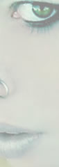
 Like the other portfolios already seen, Tentacle Eye is a (french) long collection of artworks and photoes with same height and different width placed side by side in a nested table layout. The first section, dedicated to news, display a vertical bar to scroll the content; a vertical bar is displayed, unfortunately, in the entire page for those screen under 1024×768 resolutions, that can’t immediately view the links in the footer section.
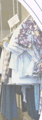 A thin blue line drawn by a biro guide the Nana website ’s user to do an horizontal tour along what this clothing shop offer and feedbacks all displayed in a series of images. (unhappily insterted in old nested table tags…this is real vintage style)
 The ‘drawing showcase’ PasquÃn o Panfleto is the first dynamic site-a weblog- listed in these pages. The hp shows a series of images with ‘category’ and ‘comments’ hidden links below; every page related to a post (like this) has a different width (set inline in “content†div) and display the artwork with on the right a div with text content, a div for comments with vertical bar (see here), and a div with form for comments – all tall about 510px. An horizontal menu with hidden items is placed on the left side of the body under the title.
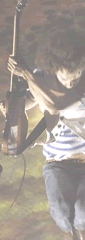 The content of Wolfmother (australian rock band) flash site is placed in a long semi-transparent strip -about 400px tall-where there isn’t empty space from one section -about 760px wide- to another.
A menu with cardinal numbers (that let display the name of section on the left) under the strip scroll it placing the chosen section at the center of the viewport, and text+images paragraphs are inserted in boxes with vertical scrolling.
 The ‘side by side images’, a constant of the horizontalway, aren’t only pictures placed one near the previous: they sometimes describe a journey, an evolution, a step-by-step in a long walking towards right ( = the end or the next page?).
The Bluesfear Worm explode in the first screenshot ready to show this infinite mutation, scroll after scroll.
 Instead of the absolute positioning like in the previous CZG designs, the text sections of Radio Zen use the more comfortable float CSS property to be placed side by side, avoiding the calculation and the setting of the distance from the left side of the body.
The two menus are displayed inline under the content, and a fixed image on the top create a nice effect taking advantage of the page scrolling.
 Beca / Voices is a simple but beautiful example of how Javascript can help for a better navigation of a horizontal site: the content of this site -the introduction of a house music vocalist- is splitted in the three section (containing title+subtitle+one paragraph) that could be displayed after a scroll on the left of the body near to a fixed menu with internal links inside.
Three arrows guide the user to the next section inserting so a path to follow in the exploration of the page.
 “Custom Designed Paper Model Collection†by Shin Tanaka is another nested table showcase of artworks that display them in a series of side-by-side images with same height and width, with below the related title and designer/writer’s logo.
 The sites that follow the horizontal way could find in Javascript a good allied in the search of a better usability. In Sandra Wiegard’s web home there are two examples of this: the implementations are not unobtrusive, but remain interesting. 1)The scrolling of the four pages is accompanied by a menu on the top of the page that automatically is positioned (approximately) at the center of the viewport; 2)Clicking on one of the links on the sub-menu, furthermore, the page scrolls to the selected (max 320px tall) text section.
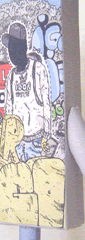
 Vault49’s site is a piece of pure art inserted in a HTML+CSS (all in one! with very old inline properties and obsolete
 maps and fonts tags) page displaying big images spaced out by four text section like the “portfolioâ€-a big div with links inside opening popups-and the “newsâ€,a div that face to a big problem of the horizontal way: the “dynamic” lenght of the text. IOW, the text which the developer can’t know the height at the creation of the code: it is insterted here in a div with overflow:auto displaying a vertical bar to scroll the content.
